After speaking to John to make sure it didn't sound unprofessional I settled on the name Pencilwound. I originally came up with this name the same year I started university when I was trying to figure out an online name for my Steam account so I could play Left 4 Dead 2 with my friends. I wanted something that sounded like it could be related to design but at the same time killing zombies.
The twist behind this meaning is I have an unusual grey lump on my left arm where I was stabbed with a pencil by some kid in school. All of these things form together to form my name which I use for all of my online ID's now apart from my twitter where it is already taken by some guy in Ottawa.
I didn't want to use a font for the logotype as it wouldn't be 100% personal, therefore I began sketching.
I had to choose very wisely in regards to typeface restrictions as I needed enough weights to be an efficient part of my identity so hierarchy can be used if needed.
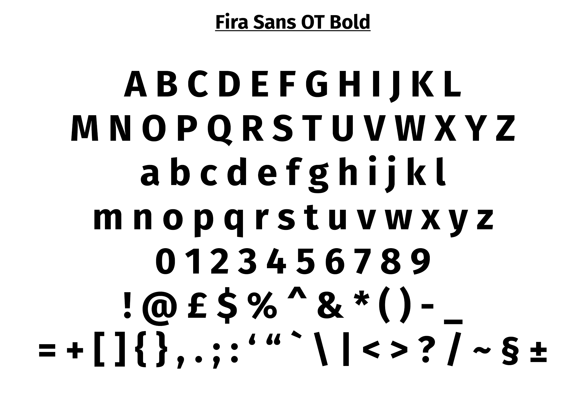
The typeface which I found fit the bill the best is Fira Sans + Mono.
This typeface is an Open Source font designed by Erik Spiekermann in the 1980's originally for Mozilla Firefox. I needed to know the licence rights and such and discovered it was 100% free which of course made me very happy haha.
"The SIL Open Font License (or OFL in short) is a free and open source license designed for fonts by SIL International for use with many of their Unicode fonts, including Gentium Plus, Charis SIL, and Andika. The license is considered free by the Free Software Foundation, which states that a simple hello world programis enough to satisfy the license's requirement that fonts using the license be distributed with computer software. The Debian project agrees."
http://en.wikipedia.org/wiki/SIL_Open_Font_License
I'd already mentioned previously in my investigation of colour meanings that I would be using turquoise in my branding to signify communication, clarity of mind, practical and idealistic. I will group this colour with black and white for legibility and clarity to further compliment my branded colour.
This shade of turquoise was chosen as it is achievable both in print and web at the same time as being a shade of colorplan stock colour from GF-Smith making branding more consistent for stationary.
I tried my logo in both black and white on the turquoise background. I felt that the black appeared as more professional and as if it was written straight onto the background with a calligraphy pen.
The more and more I looked at this colour, the less it felt right. I sent the colour to a few people and asked them if they thought it represented me well, I got not yes answers. A few said a darker colour would work with me more, they couldn't put their finger on why but it would. I have always liked the use of dark blue in certain elements of branding so I gave that a try and it felt so much more comfortable, and also looked more professional.
For stationary I ordered a nice selection of GF Smith stock on which I would print my business cards, promotional pack and envelopes (along with some stock for another brief). This gave me the opportunity to keep perfect 100% consistency across my products.


Leave your comment